Roy Lichtenstein. I know what you are thinking, that might not be a common name, and you may be wondering, who is he? Well, if you are sitting thinking ‘who is Roy Lichtenstein, what does he pain?’ Well, that is exactly what I am here to tell you today.
Who is Roy Lichtenstein?
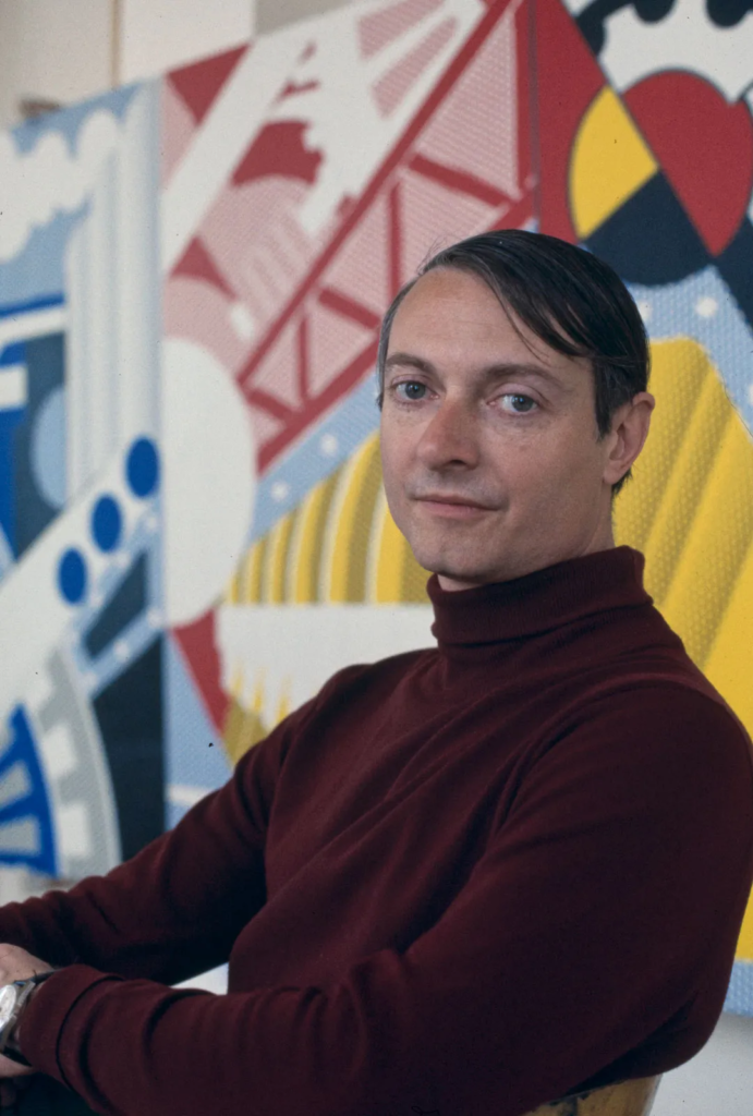
Roy Lichtenstein was an American artist who died in his early 70’s in September 1997, unexpectedly from pneumonia. He focused on pop art- which is similar to a comic strip kind of style and became one of the leading artists of the American Pop Art Movement.
Like I mentioned before, he worked with pop art and was inspired by advertisements, popular American culture and comic strips. In 1943 he was drafted and sent to Europe to fight in WW2, and when he returned from the war, he completed an undergrad and got his masters degree in Fine Art. By the late 60s, he turned to famous artists such as Matisse and Picasso for inspiration.
Roy Lichtenstein painted many famous paintings, which include;
- Crying Girl- 1963
- Whaam!- 1963
- In The Car- 1963
- Masterpiece- 1962
- M-Maybe-1965
- Look mickey- 1961
- Hopeless- 1963
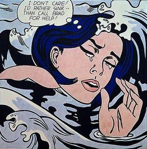
But one of his most famous, and the one I am going to discuss and tell yous all about today, is ‘Drowning Girl’- from 1963.

Roy Lichtenstein- drowning girl!
Composition
Lichtenstein creates a circular composition. The waves surround the woman like a whirlpool drawing our eyes around the image and into the centre of her face. This supports the idea that she is drowning and being engulfed by the sea.
With the use of contrasting warm pinks and reds in the girl’s face and hands, and cool colours in the waves, this allows the girl to be the main focal point as warm colours feel closer to us as they are advancing colours and therefore draw our eye to her face and hands.
Media handling and techniques
He painted the Ben-day dots by hand using a stencil, to imitate the historical technique used in newspapers and other forms of mechanical reproduction. This gave the illusion of shading in illustrations and altering the colour palette using the base colour too. Here they are visible as the red spots if you look closely, filling the girl’s skin and lips, the white background alters the brightness of the red, producing different shades of pinks.
Working by hand, he first copied the source image from a comic book and altering its composition to his liking. He then projected his image onto a canvas and traced the image, outlining it’s figures and forms in black outlines and filling in the images with primary colours or with patterns of repeating dots that replicated the Ben-Day dots commonly used in the mass printing processes.
Colour
He applies a simplistic colour pallet in most of his work, usually just primary colours and black and white. He does this to mimic mass-produced images and mechanical printing techniques, especially used in comic strips.
Warm colours are confined to the centre of the painting through skin tone and the pink of her lips that immediately draws our eyes to her face as it contrasts against the cool blue shades of the waves, making the girl the focal point.
Line
Lichtenstein applies a bold black outline around all the imagery in the painting. This creates an unrealistic and stylised image. He does this to make his painting look like a mass-produced comic strip.
The use of sweeping, curved lines in the waves and her hair create a swirling, spiralling movement in the painting that supports the idea she is being pulled under by the current
and draws our eyes around the image in a circular movement.
Tone
There is very little tone in this painting creating a very flat and 2D image. Lichtenstein purposefully does this to make it look like a mass-produced comic strip highlighting the Pop art style.
His application of ben-day dots is used to give the impression of tone. The dots are placed closer together to show a darker tone and further apart to suggest highlights. This simplified application of tone is seen on the lips where we can see a highlight on the left side of her lip that suggests a light source.
Texture
Lichtenstein applies his paint smoothly and seamlessly in the block area of blue and black, creating flat areas with a smooth surface to replicate comic strip imagery.
The only slight suggestion of texture is in the hair and waves. Lichtenstein applies bold wavy lines to suggest the girl’s sleek, flowing hair and the ripples in the waves. However, the lines are bold and simplified to add to the comic strip aesthetic.
Shape and form
The shapes of the waves surrounding the girl are organic and irregular adding a slight softness to the bold, harsh image. However, the shapes are simple and lack detail, strengthening the idea that Roy Lichtenstein wanted to showcase a comic book style to his piece.
Lichtenstein does not enhance the form of the piece as he applies limited tone to this painting, making the image incredibly flat and 2D. The only slight suggestion of form is on the girl’s lips where he has applied an oval highlight suggesting the round form of her lips. This influence can be
seen in his love of comic books, as they too use a similar style and technique.
pattern
The repeated swirling, spiralling shapes of the waves create an organic pattern surrounding and swallowing the girl. Drawing your eye to the girl and making her a focal point.
Roy Lichtenstein application of ben-day dots is used to give the impression of tone by applying carefully measured and spaced-out dots that from a distance create tone and change of colours. Due to the measured approach, the dots are placed closer together to show darker tones and further apart to suggest highlights, creating a geometric and regular pattern.
To learn about the great Frida Kahlo, click here!
To purchase Roy Lichtenstein painting ‘drowning girl’ click here.
